In an attempt to capture a wider audience and also as a way to complete my face tuh face illustration project, I took to the site Behance to portray an accumulation of my finished artwork. Behance is a website that allows you to create an online portfolio of creative projects an connect with a network of people. Individuals have been hired and discovered through Behance due to its easy accessibility. Self promotion is the backbone of this platform.
I have published my Face tuh Face project that can be viewed here.
So, we have, unfortunately come to the bitter-sweet end. My goal, in the beginning was to find an illustration style that I could call my own. Though, I do not think I have quite achieved that goal, the process has been a beneficial one nonetheless. I have grown a greater appreciation for the artists that live in the creative sphere. I believe part of my talent lies in mimicking those of others, which lends itself to being more difficult than one may assume. My style will continue to blossom as I journey down the path of a graphic artist, I have no doubt about that. I'm currently under the impression that only when my back is against the wall, and I am really required to produce art that completely reflects myself is when my creativity will kick into high gear. I thrive under pressure and I think that would be a huge motivation for me. As for now, my technical skills have improved significantly, as I have illustrated using techniques that I doubted were capable of my hands.
It is extremely hard to allocate time for personal illustrations in this field and this project allowed for just that. Now it is back to desigining to satisfy clients rather than myself, which can be pretty challenging. I guess the end isn't as sweet as it is bitter.
-S.R

Monday, 1 December 2014
Sharing the Hot Seat
As the final aspect of my collaboration with Roxanne, or Roxara as I like to call her now, I agreed to be interviewed by her, alongside Allison the owner of the blog Artful Trini. The experience was a slightly bumpy road due to the technical difficulties that presented themselves. We all know that you can't completely rely on technology. As such, the interview was filmed and re-filmed 2 weeks later.
The interview consisted of thirteen questions based on art and my journey as a graphic artist. This included my inspirations as well as my fears. The interview went smoothly due to the fact that my life revolves around being a graphic artist and it is easy to speak on a topic that I live and breathe. It honestly only took one take. Now, I am no professional speaker, so imagine my shock when I realized that both Allison and I were able to deliver our answers, with no script, speaking straight from our heart. It was easy to tell how passionate we both were about our work, and it was very refreshing to meet someone who shared a similar passion to mine.
Here are some images taken from shoot numero uno:
Left: Zamfir, Myself, Roxanne & Allison
The second day of filming went just as smooth as the first and we made sure to put things in place to ensure that there would not be a repeat of the difficulties faced last. A link to the YouTube video will be posted here on my blog very soon so look out for it.
-S.R
Saturday, 29 November 2014
Inspiring Creativity at our Library
A couple days ago I met up with Sonia Bernard, from the blog The Misadventures of a Library Assistant. She approached me to offer a short free class, to children in the Young Adult Library. I thought this was an amazing idea that would give me the opportunity to interact with creative young people and pass on my knowledge to them. Prior to this experience I had never stepped into the teaching sphere in regards to art. I had always been the student.
Many people are not aware that the library offers free computer classes to persons, none of which incorporated any aspects of art. It was not something that was strict or rigid because the people who took the class were school children who happened to be visiting the library that day. We pitched the idea of partaking in a free class, taught by myself, using the computer facilities provided by the library and we received a few eager responses. The nature of the class was an individual, one on one lesson, which I personally think is the best teaching method. Therefore only two children were selected.
Due to our surroundings, the many children occupying the library that day and other restrictions we were unable to film the class like we had hoped to. We did however, film a short introduction to the collaboration and a brief interview with one of the participating students.
The class lasted approx. twenty (20) minutes for each student, and was based around the graphic design software, Adobe Illustrator. The public computers available were not equipped with the program so a portable version was used from my personal USB flash drive. The class included familiarizing the two students with the program and teaching them the a few standard tools and basic uses.

The tools that I touched on were: the selection, rectangle, paintbrush and fill tool. A combination of these would produce basically anything. I remembered first starting out these were the tools that I felt most comfortable using, until I felt confident enough to use to the pen tool which is a very difficult to master but is the basis of all my artwork today.
Here is a very short explanation of the tools illustrated above.
Selection tool: Used to select, move and transform or manipulate the size objects
Rectangle tool:Used to create various basic shapes: rectangle, rounded rectangle, ellipse, polygon and star
Paintbrush tool: Draws organic paths or strokes (lines)
Fill tool: Fills shapes and strokes with a selected colour
When the students were fairly familiar with the tools, I began to show them how they could be used together to draw a simple self portrait. I was completely shocked as to how quickly the students grasped the concept of the program. They were able to move around and create without much help from me. I really believe that their art showed a lot of great potential and I really hope that they keep pursing art, in any shape or form, not only digital. Here is a short interview on youtube that I did with one of the participants.


Many people are not aware that the library offers free computer classes to persons, none of which incorporated any aspects of art. It was not something that was strict or rigid because the people who took the class were school children who happened to be visiting the library that day. We pitched the idea of partaking in a free class, taught by myself, using the computer facilities provided by the library and we received a few eager responses. The nature of the class was an individual, one on one lesson, which I personally think is the best teaching method. Therefore only two children were selected.
Due to our surroundings, the many children occupying the library that day and other restrictions we were unable to film the class like we had hoped to. We did however, film a short introduction to the collaboration and a brief interview with one of the participating students.
The class lasted approx. twenty (20) minutes for each student, and was based around the graphic design software, Adobe Illustrator. The public computers available were not equipped with the program so a portable version was used from my personal USB flash drive. The class included familiarizing the two students with the program and teaching them the a few standard tools and basic uses.
A few basic illustrator tools
The tools that I touched on were: the selection, rectangle, paintbrush and fill tool. A combination of these would produce basically anything. I remembered first starting out these were the tools that I felt most comfortable using, until I felt confident enough to use to the pen tool which is a very difficult to master but is the basis of all my artwork today.
Here is a very short explanation of the tools illustrated above.
Selection tool: Used to select, move and transform or manipulate the size objects
Rectangle tool:Used to create various basic shapes: rectangle, rounded rectangle, ellipse, polygon and star
Paintbrush tool: Draws organic paths or strokes (lines)
Fill tool: Fills shapes and strokes with a selected colour
When the students were fairly familiar with the tools, I began to show them how they could be used together to draw a simple self portrait. I was completely shocked as to how quickly the students grasped the concept of the program. They were able to move around and create without much help from me. I really believe that their art showed a lot of great potential and I really hope that they keep pursing art, in any shape or form, not only digital. Here is a short interview on youtube that I did with one of the participants.
Monday, 24 November 2014
Roxara
This portrait had to have been my second most challenging one to date, with my Gaks inspired portrait taking the number one spot in that respect. Sara's portraits have a very sketchy pencil texture to them which was difficult to mimic without it looking too harsh or forced. It was also, pretty impossible for my version to look identical to Roxanne's portrait. Sara's style required me to completely change her face shape and structure, elongate her neck and decrease her large oval eyes. I of course, however, retained her hair texture, fulling and adding more length for aesthetic purposes. Her lips and nose remained more or less the same. I produced two versions, with a slight variation, one with pupils and the other without. Roxanne requested that her pupils be kept in the portrait. which in my opinion, gives the portrait a soul.
-S.R

Roxara

Saturday, 22 November 2014
A Good Fit: Sara & Roxanne
Continuing on the Sara Golish train, my focus and illustration this week, will be inspired by Moondust. I do not think that my portrait, however, would do her style justice so I have enlisted the help of Roxanne Coombs, the owner of the blog Things That Annoy and Things to Enjoy. Roxanne has graciously provided me with an image of herself to pick apart for this portrait.

Roxanne Combs
As you can see from the image, Roxanne has fairly long dreadlocks which ties perfectly into what Moondust represents; the beauty of natural hair. My hair is also natural but in the image that I have been using as a reference, my hair had been straightened using a heating tool which does not communicate the same message. When Roxanne first approached me to collaborate I thought of doing her portrait inspired by an artist she choose. She did not have an artist off the bat, and could not find one that appealed to her after much research. This was when a light bulb flashed in my mind and I presented her with the idea of using a Moondust piece. She was almost as excited as I was and her only stipulation was that I retain the pupils in her eyes, which I agreed to do without hesitation. For this illustration I wanted to dig a little deeper, and truly put myself in the artist's mind to achieve a well thought out portrait that communicated a message.
-S.R
Her Sun & Moon: Sara Golish
Sara Golish, in my opinion epitomizes an artist with a distinct, and extremely unique style. This style has gained her popularity in the past years and cannot be mistaken for the work of another. According to Sara's online biography posted to her website, she is a Canadian visual artist who specializes in portrait and figurative drawings. Her style embodies the spirit of women and breathes new life into each portrait. From my research of her, I am led to believe that females are her preferred subject. She currently has two completed drawing collections; Sundust and Moondust. Each woman is drawn with an elongated neck, thin almond eyes (sans the pupils), chiselled cheekbones, naturally textured hair, and is adorned with either jewellery or patterns very reminiscent of war paint (sometimes a mixture of both). Both collections highlight the beauty and exoticness of African women.
Moondust
This series, as stated on Sara's blog is her salute to Afro-futurism and naturally textured hair women Afro-futurism, defined by Womack 2012 is
"...the growing artistic movement and critiques that followed narratives of people of African descent in a sci-fi, futuristic treaties."


Moondust
This series, as stated on Sara's blog is her salute to Afro-futurism and naturally textured hair women Afro-futurism, defined by Womack 2012 is
"...the growing artistic movement and critiques that followed narratives of people of African descent in a sci-fi, futuristic treaties."
She is inspired by music of the 70's and 80's, futuristic and retro influences. None of the portraits are actually persons and the eyes are meant to give an otherworldly feel.
-S.R
All images belong to Sara Golish
-S.R
All images belong to Sara Golish
Sundust
Friday, 21 November 2014
Journey
My character design for the story, Colours on the Wall, is that of Chanel. Chanel is 21 years of age and a close friend of Arona. Though they are distant friends, Arona holds a special place in Chanel's heart. Chanel decides to board a plane in hopes of arriving at Arona's in time to reveal her surprise.
In my design, I tried to incorporate a very warm and inviting feel for Chanel. Nuri is a sweet young girl, facing her own struggles and I wanted Chanel to portray the role of a kindhearted big sister. She is someone who Nuri can rely on and seek for advice. I personally believe that Chanel's eyes really capture her overall positive spirit. Anietha is amazingly talented at portraying emotions in her character illustrations so I aimed to channel that as well. I put a lot of focus into her eyes because it was difficult to get the look of them right. I did two versions, just as Anietha produces, one in black and white and the other in colour. Below are the illustrations as well as the original short story that introduces Chanel into the plot of Colours in the Walls.
-S.R


Journey
The plane
was about to land; Chanel quickly grabbed the side of her seat and braced
herself before the wheels hit the ground. She then blew a sigh of relief as the
plane finally came to a stop. She thought to herself that no matter how many
times she travels, she could never get use to this, but at the same time she
had to endure it because there’s no way she would miss this very special day.
To read more of the short story, head over to ABCStorytelling.
Illustration by: Shanice Vitalis
Story by: Anietha Charles
Monday, 10 November 2014
Character Design with ABCStorytelling
Anietha Charles, owner of the blog ABCStorytelling is an avid writer and illustrator. In her recent writing, Colours on the Wall, she speaks about a colour blind protagonist, Arona, who lives her life in a wheelchair accompanied by her dog, Nuri. Herself and Nuri have a deep connection associated to their related colour blindness. She feels like an outcast amongst others and her journey begins as she starts to question colour.
Aneitha accompanies each chapter with a relating illustration, first in black and white, then in colour. They help to enhance her story and gives the reader a more personal look into Arona's life and struggle. She has a distinct style in her illustrations, very anime inspired, and using her depiction of Arona, I am going to attempt to create myself into a character that can visually fit into the story.
-S.R
All images belong to Anietha Charles
Friday, 31 October 2014
Freaky Friday
Happy Halloween!
I do hope that everyone has a particularly creepy Halloween, inclusive of lots of sugary treats (I use Halloween as an excuse every year to stuff my face with chocolate). As promised here's my zombie portrait inspired by marvelshead on Fiverr.

I particularly enjoyed this illustration, as I am very fond of cartoon style drawings. Also, how cool is it to see yourself in zombie form? Pretty awesome. I guess that's why his gig was so popular. The difficulty level was low due to his very distinct style of zombies. All I needed to do was keep certain signature aspects of my portrait and have just fun with the rest. And of course my zombie had to have my signature winged eyeliner, I mean why not?
-S.R
I do hope that everyone has a particularly creepy Halloween, inclusive of lots of sugary treats (I use Halloween as an excuse every year to stuff my face with chocolate). As promised here's my zombie portrait inspired by marvelshead on Fiverr.
I particularly enjoyed this illustration, as I am very fond of cartoon style drawings. Also, how cool is it to see yourself in zombie form? Pretty awesome. I guess that's why his gig was so popular. The difficulty level was low due to his very distinct style of zombies. All I needed to do was keep certain signature aspects of my portrait and have just fun with the rest. And of course my zombie had to have my signature winged eyeliner, I mean why not?
-S.R
Wednesday, 29 October 2014
2014 Zombie Apocalypse
This Halloween I was inspired by a gig on Fiverr. I had no previous knowledge that this website even existed. Whilst browsing the internet I stumbled upon it, or should I say shoved in its path by an unworldly being lurking around my computer. However you want to look at it, I was glad to have found it. Fiverr is an online community where people, mostly freelancers, can offer their services or "gigs", starting at the cost of USD 5.00. I found this gig in the graphic design section, by marvelheads. He offered customers personalized zombie illustrations that he would create, for USD 5.00. I could not have stumbled upon a better place. He used his unique style of illustrating zombies for each customer. There are many styles of drawing zombies, ranging from realistic to completely comical. I had never seen a style quite like his, so of course I had to recreate my own portrait, taking out and adding elements as I went along. You will have to wait till the clock strikes midnight on Halloween to see what I have created....
Just kidding! The portrait will be up Friday, when the clock strikes 12, for lunch.
Check out my Facebook page to see the zombies marvelhead has manifested and my Tumblr for more Halloween art inspiration.
-S.R
Just kidding! The portrait will be up Friday, when the clock strikes 12, for lunch.
Check out my Facebook page to see the zombies marvelhead has manifested and my Tumblr for more Halloween art inspiration.
-S.R
Monday, 27 October 2014
Two is better than One

Khloe Kardashian
Mixed Media: Adobe Illustrator and Coloured Pencils
Inspired by Hayden Williams' fashion sketches
-S.R

My Original artwork

Reference Image courtesy Gossip Magazine
Friday, 24 October 2014
Coming Soon: Mixed Media ft The Sketch Paper Project
Working with mixed media is something I rarely do as a graphic artist. Typically all my work is done digitally and whoooshh off to the printers. I'm particularly interested in the different textures mixed media introduces. It can bring a different flare to a piece of artwork.
Chantal is an artist from The Sketch Paper Project who deals with hand drawn portraits using pencils. She focuses on celebrity figures and has, thus far, done solely black and white pieces. Her variety is in the persons she draws, whereas mine is in the styles I use to recreate oneselfie photo.

We have teamed up to create a mixed media piece: both digital and hand drawn combined, for a result that neither one could do without the other.
We both continue to strive to build on our skill set and this collaboration is a testimony to that. As seen in previous posts, I have only done self-portraits, which I have grown comfortable in producing. For this piece, however, I have chosen to do a celebrity, Khloe Kardashian, sticking to a female portrait but not my own. Also, I have continued my experimental style trend by using Hayden Williams as inspiration for this piece. Mr. Williams uses fashion sketches to depict several different celebrities and their outfits. He is more focused on the garment rather than the celebrities themselves. The style is very quick and almost abstract. Lines are loosely drawn and filled in. Its about quickly putting ideas to paper and then cleaning up in the end.
All images belong to Hayden Williams


-S.R
Chantal is an artist from The Sketch Paper Project who deals with hand drawn portraits using pencils. She focuses on celebrity figures and has, thus far, done solely black and white pieces. Her variety is in the persons she draws, whereas mine is in the styles I use to recreate one
Allison Hinds
Image belongs to The Sketch Paper Blog
We have teamed up to create a mixed media piece: both digital and hand drawn combined, for a result that neither one could do without the other.
We both continue to strive to build on our skill set and this collaboration is a testimony to that. As seen in previous posts, I have only done self-portraits, which I have grown comfortable in producing. For this piece, however, I have chosen to do a celebrity, Khloe Kardashian, sticking to a female portrait but not my own. Also, I have continued my experimental style trend by using Hayden Williams as inspiration for this piece. Mr. Williams uses fashion sketches to depict several different celebrities and their outfits. He is more focused on the garment rather than the celebrities themselves. The style is very quick and almost abstract. Lines are loosely drawn and filled in. Its about quickly putting ideas to paper and then cleaning up in the end.
All images belong to Hayden Williams
-S.R
Friday, 17 October 2014
Let there be Colour! Portrait #2
I am entirely please with the outcome of this portrait. The colours and detailing definitely bring something new and exciting to the table. My biggest struggle had to have been simply selecting what colours to use. Last minute I decided to change the colour of the hair from a natural brunette to a red head. I had to change certain aspects, like the hairline that MJ Lindo uses a lot, as well as the coloured hair to keep within her style. The wooden background enhances the hair and mimics its golden, blond colour beautifully. The technique I used for the shading was surprisingly easy to apply and produced a very soft blend of colours that MJ achieves with paint. I really enjoyed the process as it made me finally step into the world of colour that I have been avoiding for years. A close up of the details in this portrait can be found on my facebook page.
-S.R


Thursday, 16 October 2014
Colourful Shadows?
When it comes to shading I am completely old fashioned. I typically use a gray scale for shadows, and white for highlighting, which can both be tinted a particular colour depending on the job at hand.


Photo courtesy Diane Wright
MJ Lindo's technique takes a completely different approach however, and this left an unsettling feeling in the pit of my stomach. She uses a combination of pure and mixed colours for both highlights and shadows. Some colours are fleshed toned, while others aren't. One would not expect yellows, blues and purples to be used in a portrait. The result is very ethereal, capturing the essence of sensitivity. This technique is extremely difficult. One needs to completely understand the color wheel, to effectively communicate the emotions behind the portrait. The colours need to be in sync with each other, as well as be balanced throughout the piece. Repetition of color is important. If you look closely, the turquoise blue used under the neck and shoulder is repeated within the iris of the eye. This ensures a unified look.
Photo courtesy MJ Lindo
Using colour in a portrait is already an accomplishment for me but her unconventional use of colour is completely outside of my comfort zone. My admiration for MJ is growing as I continue to work on my portrait, which will be soon revealed.
-S.R
Saturday, 11 October 2014
Muy Linda: MJ Lindo

I have been following MJ Lindo on instagram for almost a year now and it did not take long to fall completely in love with her portraits. Her medium is paint, which she uses to create very whimsically beautiful portraits of women. These portraits are extremely detailed facially, which is a nice contrast to my previous Gaks inspired minimalist portrait. Her highlighting and shadow techniques evoke such emotion and in my opinion is a major part of what makes her work so special. Her work can appear very personal, and vulnerable. She is very smart and aware in her use of colour which is a major struggle for me. If I could, I would do all my artwork in black and white. What really caught my attention however, is her use of a wooden canvas. It creates such an interesting background, painted or left untouched. She also uses the wooden texture and lines as the hair texture for her women, which I believe to be extremely creative. It would be interesting to see if I could successfully translate her painting techniques into a digital illustration, using Adobe Illustrator and not Photoshop which effortlessly mimics the look of paint.
All images belong to MJ Lindo
-S.R


Thursday, 9 October 2014
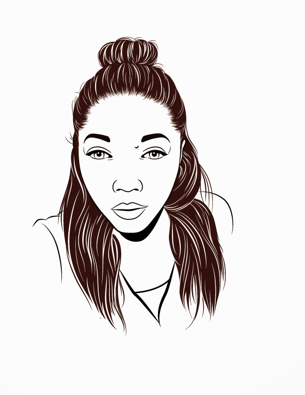
First out the Gate: Portrait #1
With blood, sweat, tears and some negative
thoughts of quitting, I have finally mustered up the strength to complete my
first portrait. It is inspired by Gaks' very clean, minimalist style of
illustrating where he focuses most of his time and energy in perfecting hair.
This serves as the main attraction of the piece. The colouring is simple which complements
the facial features that have been stripped down to its most basic lines and
form. These aspects all form his signature and what I admire the most is how effortless
his portraits appear. Only in doing the portrait I understand the underlying
complexity of his work. Looks can be so deceiving.
-S.R


-S.R
Monday, 6 October 2014
Hair Therapy
I am no vector ninja like Gaks so I have
dedicated the majority of my days to perfecting the hair in my portrait. I had
given myself a week deadline to complete the portrait and 6 out of those 7 days
were easily lost in perfecting each strand of hair. Going into it I knew that
the hair would have caused me the most strife. I definitely was not wrong. I
felt as though I had shot myself in the foot selecting Gaks as my first
inspiring artist. I knew he was a master hair illustrator and that creating
hair was very time consuming. I considered
omitting the hair on my shoulders, leaving my hair in a simple up-do or even
changing the image of myself all together. This would, of course, defeat the purpose of this journey all
together. I would not be pushing myself beyond my skill boundary. I made the
decision to keeping illustrating, no matter how cramped my fingers felt.
Seriously, I think I developed symptoms of carpal tunnel syndrome after an
entire week of hair work.
The most difficult aspect, for me, had to
have been the hairline. Any imperfections there would have attracted a lot of
unwanted attention. We all know the look of hair, the way it streamlines and
flows seamlessly into each other. It all
begins at the hairline and the space between each strand and the forehead is
unique, following a changing curve as it goes around the head. Every other
aspect can be cheated but the hair line either makes or breaks your portrait.
My main goal was not to identically
replicate the hair in the image. It was to create hair that was organic, capturing
the flow of each strand. I honestly put my best foot forward and tried to keep
a positive mind as I tend to give up easily and get lazy. For those interested
in the process, I have included step by step images for creating the hairline
below:
Firstly, I laid down each strand of hair that would create the edge of the hairline, using a preset hair brush.

Secondly,
using the pen tool, I filled in the gaps between the strands and the bun

Finally, using the same preset hair brush
in varying stroke widths, I added in highlights.
Tip: Varying the hair strands' width help
to keep the hair looking natural and less planned or rigid.
-S.R
-S.R

Sunday, 28 September 2014
Meet A Local: GAKS

Lets talk about Gerrel Saunders aka Gaks. Gaks has to be, in my opinion, the most talented illustrator in Trinidad. His attention to detail and vector skills are jaw dropping. I believe it was his meticulous hair study that initially attracted my attention. It is only fitting that I begin my illustration journey with Gaks, as his work birthed my initial interest.
The main skill that I admire from him and would like to learn is his highly detailed hair illustrations. I must admit to being very lazy with the pen tool when it comes to hair. It gets pretty monotonous very quickly. I honestly cannot see myself illustrating hair alone but I do think this skill looks damn right amazing both in his portraits and standing alone.


.jpg)
Now lets redirect the focus back to complete portraits. On Gaks' instagram I have found some of his work that I will use as a step by step guide to create a complete portrait of myself, in his style. Hopefully I do it justice, fingers crossed!
-S.R


All images belong to Gerrel Saunders
Now lets redirect the focus back to complete portraits. On Gaks' instagram I have found some of his work that I will use as a step by step guide to create a complete portrait of myself, in his style. Hopefully I do it justice, fingers crossed!
-S.R
Image Reveal
As stated in my previous post, I will be recreating one single portrait of myself using the styles of artists that have inspired me over the years. However, I did not include the portrait, until now.

Monday, 22 September 2014
Lets meet face tuh face
I am a Caribbean born Graphic Artist trying to discover her design identity. Your design identity is the definite factor that separates you from a sea graphic artists. Your characteristics, tastes and basically everything that makes you tick, helps refine this. The ways in which we are different, mirror the ways in which we design differently. You start each job designing in your unique style and build from there. My work should reflect me. Designing is a very personal experience, with each final art work (faw) representing not only me as an artist, but as me, Shanice.
Lately, however, my work seems to be falling short of my personal standards. I have realized that I do not have a style that represents me and I have attributed this to being the reason for my sudden downfall. Without a style there is no foundation to build upon and my art seems to have no direction. Maybe I did have a particular style once, but in the last two years of constantly designing for clients, and their style preferences, I seem to be lost. In my opinion at this stage in my career, it is too easy to lose yourself because your clients' preferences trump yours.
How can I design for clients, if I cannot design for myself? This is the beginning of my journey to discover myself and my style. My main interest has always been vector portrait illustrations, which are few and far in between in my current job. My aim is to select inspirational artists who have mastered the art of portrait illustrations and use them as a guide. I will re-create a single portrait of myself, using their various styles and techniques to hopefully develop a style of my own. Ultimately at the end of this journey I can have a style starting point that can be modified and refined to suit the needs of potential clients.
-S.R
Subscribe to:
Posts (Atom)